Using inMotion Cloud
Navigating around the site
Once logged in to app.inmotion.io, the top
navigation bar gives you five main screens, plus a dropdown for your account:
- Select account (top left) - switch between accounts you have access to.
- Dashboard - an overview of activity across the selected account and time period.
- Live - explore near real-time activity updates.
- Track - view previous track-based activities (something moving, like a bike ride or a spraying run).
- Site - view previous site-based activities (a fixed point, like a weather station).
- Upload - bring in data and overlays.
- User setting (top right) - settings, quality control, change password, and logout.
Select account
The account dropdown (top left) lets you choose which account's data you're viewing. This includes
your own account, plus any other inMotion accounts you've been granted access to.
Each shared account grants you a permission level - see Managing account access for what Consumer, Contributor, and Owner access allows.
Each shared account grants you a permission level - see Managing account access for what Consumer, Contributor, and Owner access allows.
Dashboard
The Dashboard is the first screen you land on after logging in, and summarises everything recorded
against the currently selected account and time period:
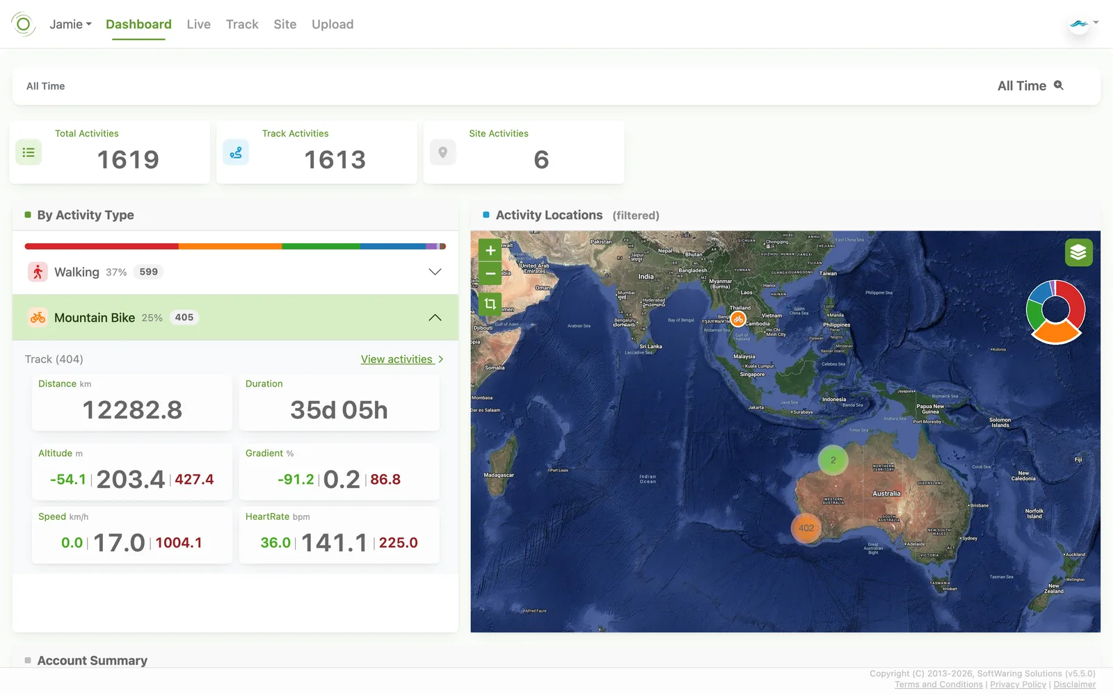
- Totals - total, track, and site activity counts for the period.
- By Activity Type - a breakdown of activities by type, each expandable to show that type's aggregate distance, duration, altitude, gradient, speed, and any other recorded variables (e.g. heart rate).
- Activity Locations - a map clustering every activity in the period by location, colour-coded by type.
- Account Summary - user, developer key, API key, and profile counts for the account.
Live activities
The Live map updates automatically as new data arrives. From here you can:
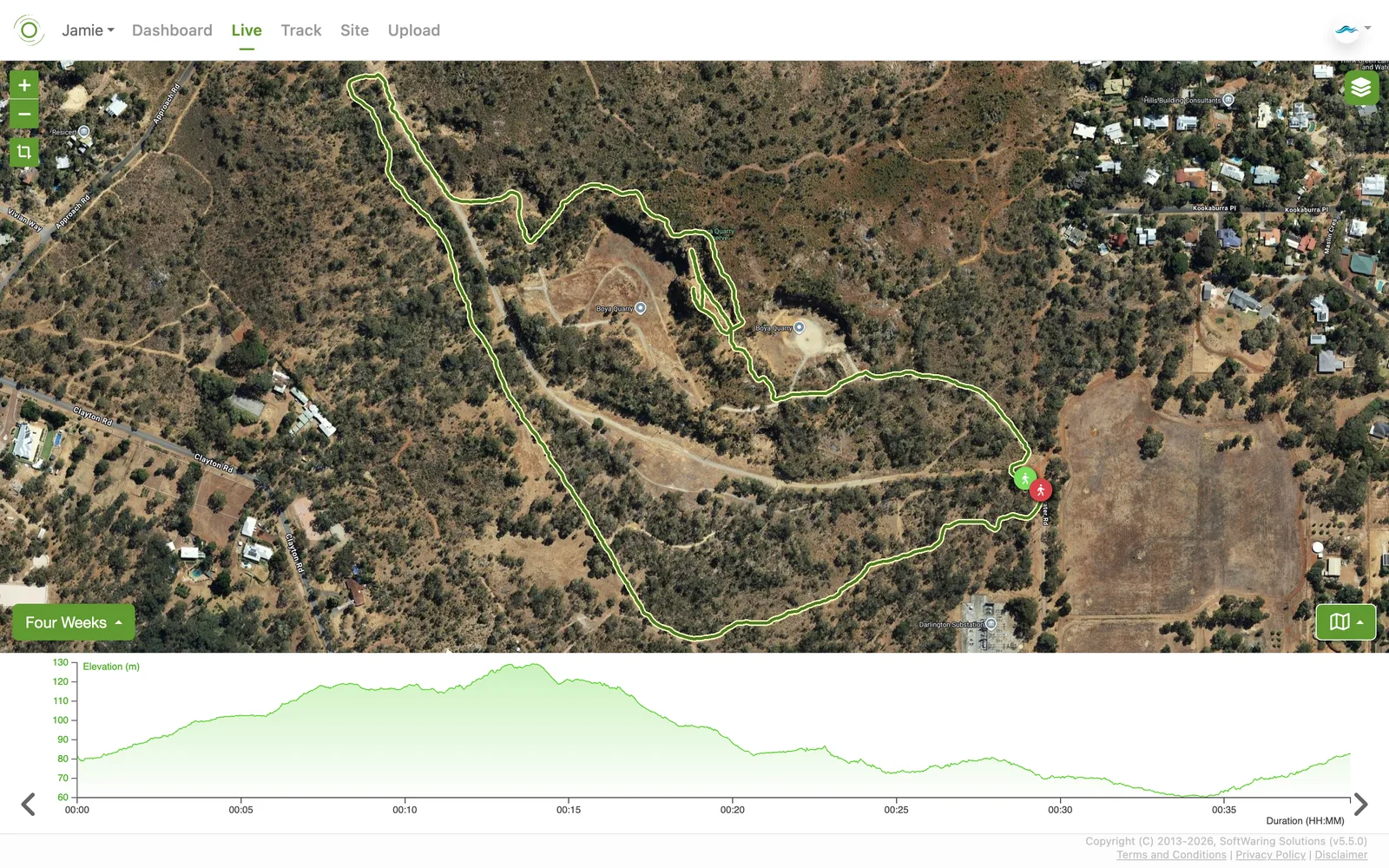
- Zoom in and out, or fit the map to all current activities.
- Drag or zoom the map manually, and switch the map layer.
- Choose how far back to look for changes (from the last 30 minutes up to the last two weeks).
- Manage which overlays are shown, and rotate through the time-series of key data variables underneath the map.
Viewing a track activity
Use the filter field and calendar on the left to find and select an activity - the calendar highlights any day
with recorded activities, and the activity list below it shows the type and time range of each one. Once
selected, the map plots its route and six tabs on the right give you different views of the data:
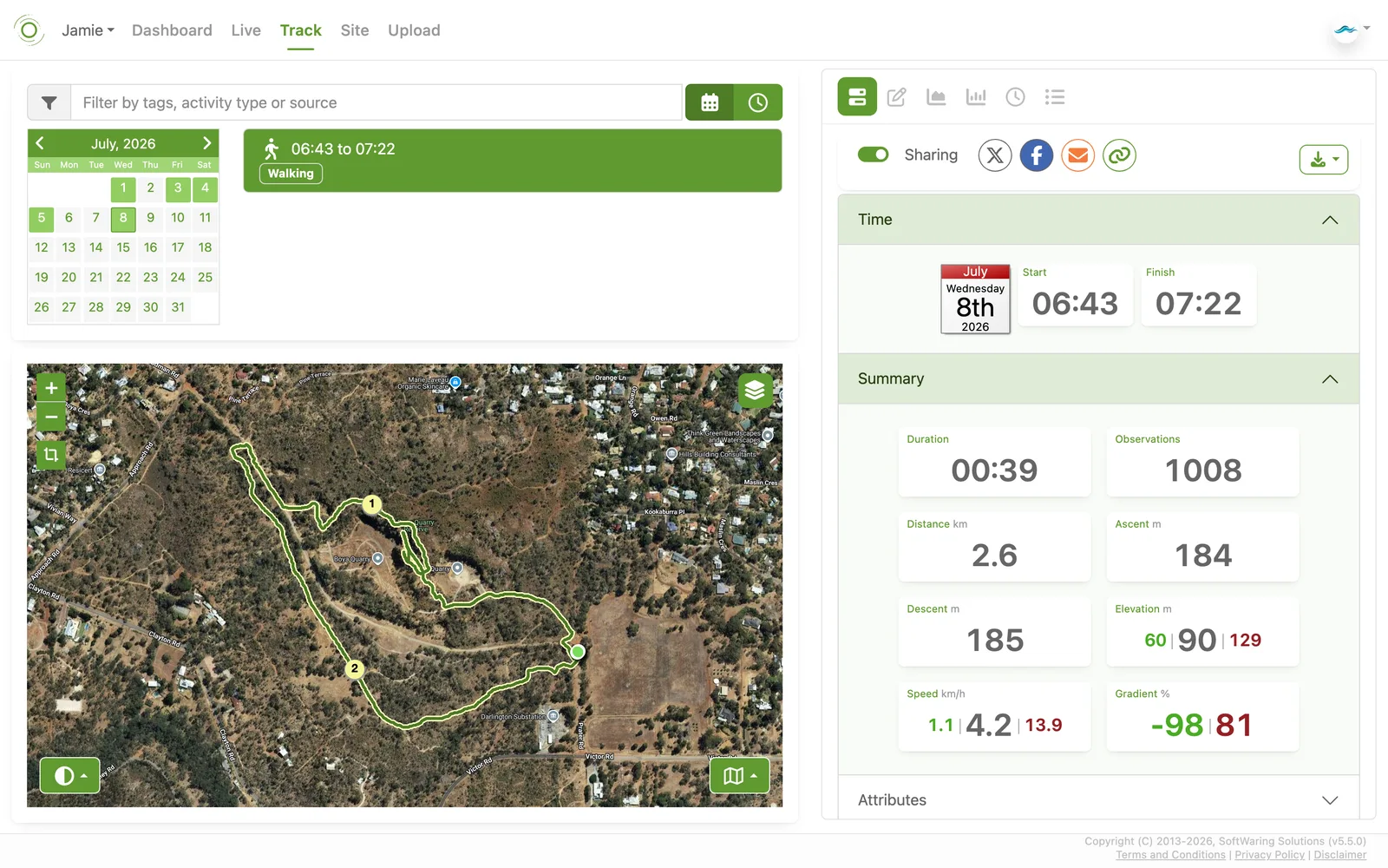
Switch the filter panel to Activities mode (instead of the default single-activity view) to compare many activities at once: a scatter plot shows every matching activity's duration across your whole history, colour-coded by activity type, alongside a combined route map coloured by whichever variable you pick (elevation, speed, and so on) so you can spot patterns across many activities at once.
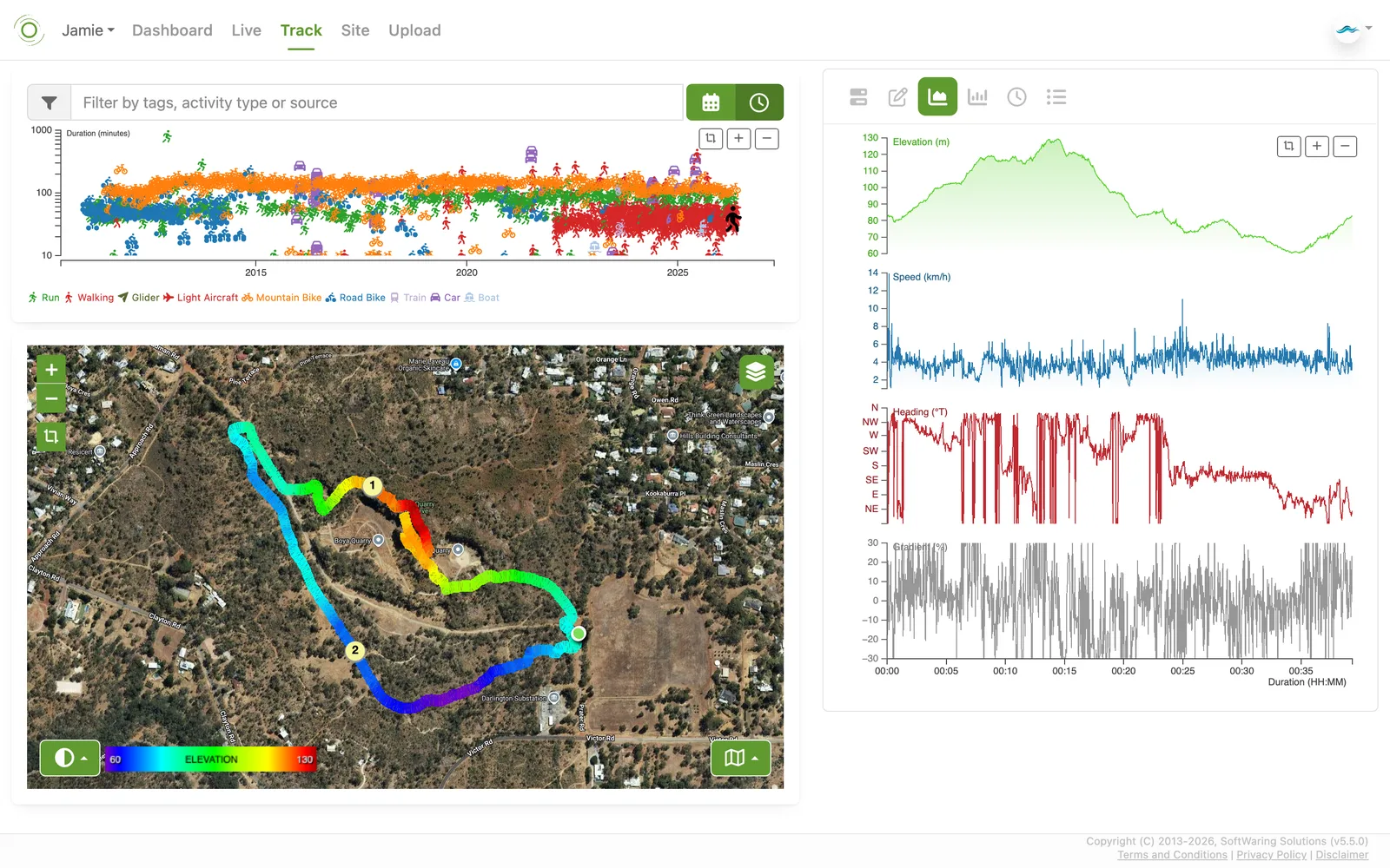
- Summary - a summary of the activity: start/finish time, duration, observation count, distance, ascent/descent, elevation, speed, and gradient, plus a toggle to share it publicly and a button to download it as CSV or JSON.
- Details - change the name, description, activity type, tags, or comment, and update or delete the activity.
- Time-series - zoomable, synchronised plots of every recorded variable (elevation, speed, heading, gradient, and more) against elapsed time.
- Statistics - a histogram for each variable, showing its distribution over the whole activity.
- Intervals - the same variables broken down into fixed time intervals (e.g. every five minutes), as a table.
- Distance - variables broken down by distance travelled instead of time, also as a table.
Switch the filter panel to Activities mode (instead of the default single-activity view) to compare many activities at once: a scatter plot shows every matching activity's duration across your whole history, colour-coded by activity type, alongside a combined route map coloured by whichever variable you pick (elevation, speed, and so on) so you can spot patterns across many activities at once.
Viewing a site activity
Available on Free (Open Source) and Enterprise accounts.
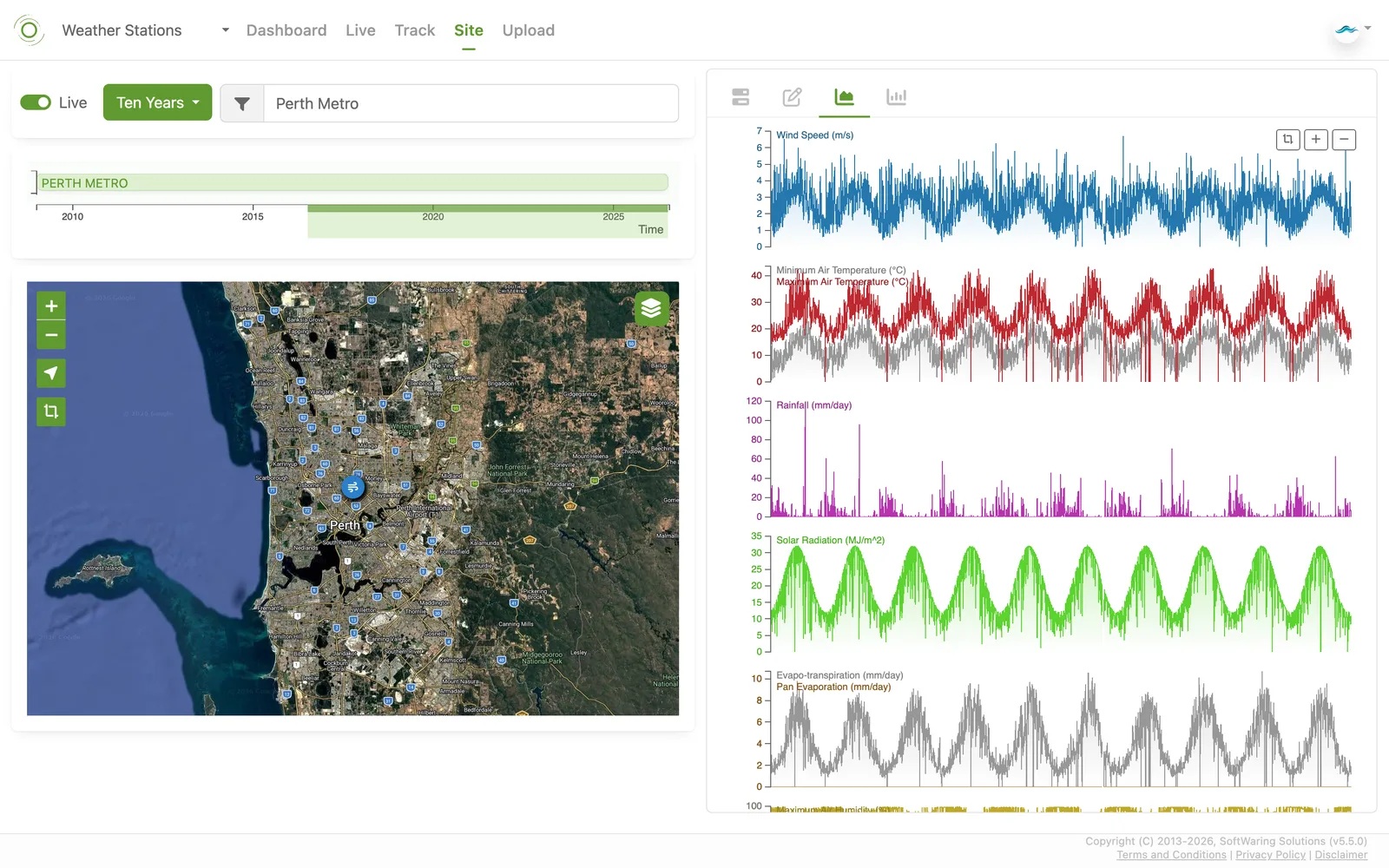
Sites work the same way as tracks, but for a fixed location such as a weather station. Use the filter field to search by label, type, or source, and choose a duration (from the last week up to your whole history) to set how far back the timeline below it reaches. That timeline shows every matching site as a horizontal bar you can click to select, and the map plots each site as a pin. Once a site is selected, switch between the same four tabs as a track activity - Dashboard, Details, Time-series, and Statistics - to review summary stats, edit details, and inspect variables over the chosen time window. Turn on Live to keep the view current as new readings arrive.
Sites work the same way as tracks, but for a fixed location such as a weather station. Use the filter field to search by label, type, or source, and choose a duration (from the last week up to your whole history) to set how far back the timeline below it reaches. That timeline shows every matching site as a horizontal bar you can click to select, and the map plots each site as a pin. Once a site is selected, switch between the same four tabs as a track activity - Dashboard, Details, Time-series, and Statistics - to review summary stats, edit details, and inspect variables over the chosen time window. Turn on Live to keep the view current as new readings arrive.
Uploading routes and overlays
Available from Consumer Premium, and Enterprise Standard and above.
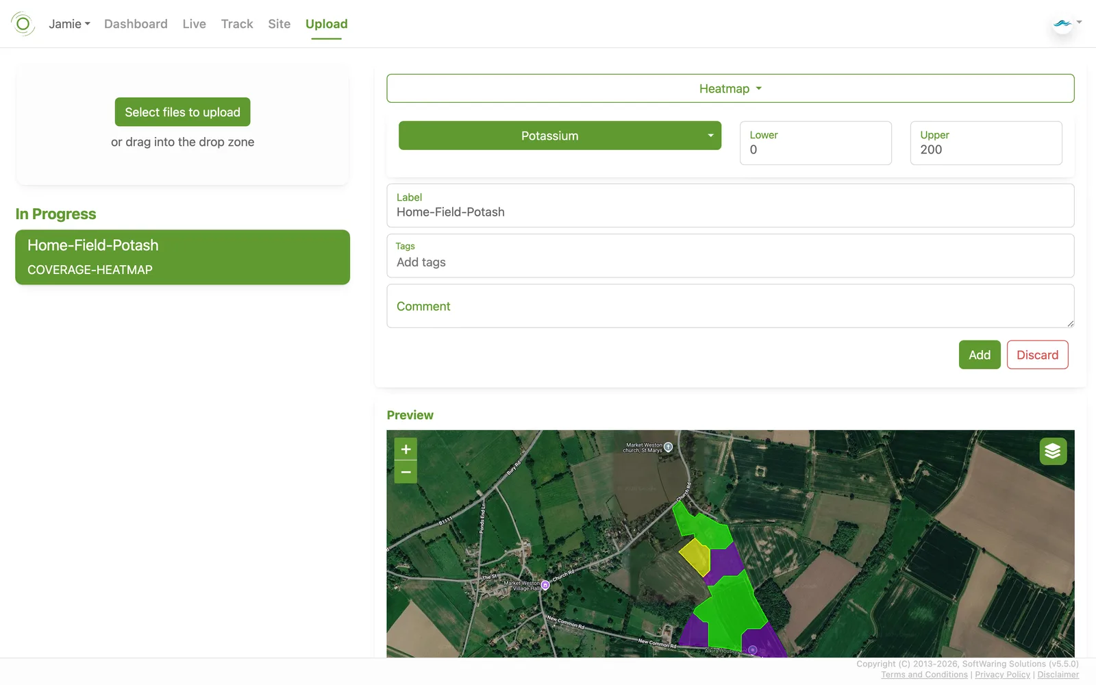
Drag and drop files onto the Upload screen, or select them directly. CSV, GPX, GeoJSON, and Shapefiles are all supported.
Each upload is shown in a preview pane before it's added to your account. From there you can choose the nature of the file, edit its properties, give it a title and tags, add a comment, and either confirm the import or abort it. You can keep uploading additional files while earlier ones are still processing.
Drag and drop files onto the Upload screen, or select them directly. CSV, GPX, GeoJSON, and Shapefiles are all supported.
Each upload is shown in a preview pane before it's added to your account. From there you can choose the nature of the file, edit its properties, give it a title and tags, add a comment, and either confirm the import or abort it. You can keep uploading additional files while earlier ones are still processing.
User settings
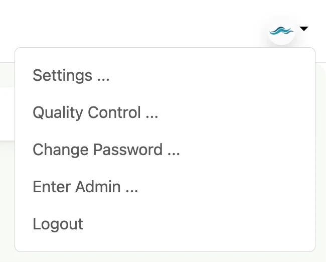
The dropdown in the top right gives you Settings,
Quality Control, and
Change Password for the currently selected
account, plus Logout.
Quality Control
Available from Consumer Premium, and Enterprise Standard and above.
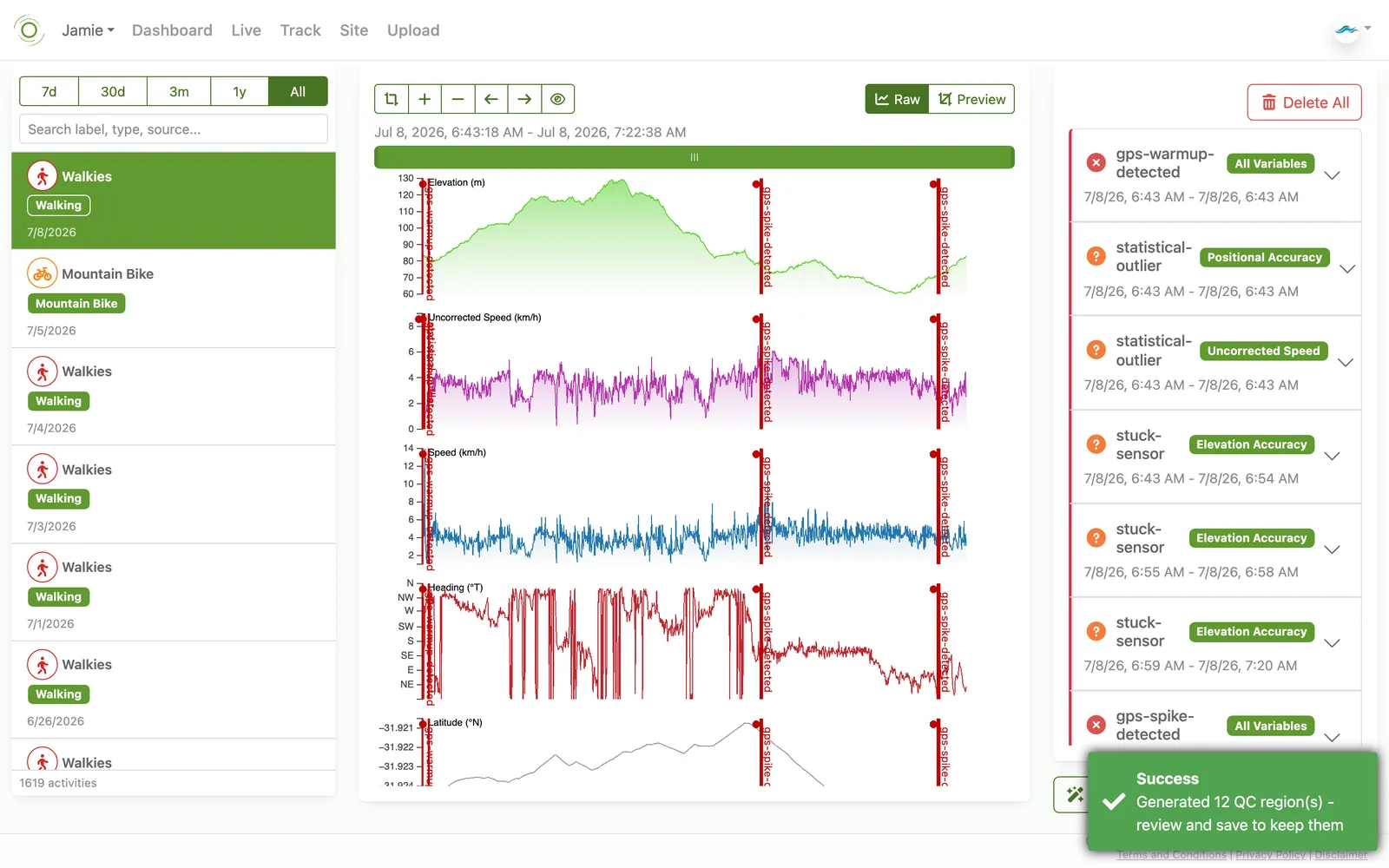
Opened from the user dropdown (see above), the Quality Control screen lets you mark stretches of a track's data as bad or suspect, so they're excluded from statistics and exports without altering the original recording. Select an activity, then click and drag (sweep) across the affected stretch of the timeline to create a QC region. Give it a meaningful label describing the problem (for example, "GPS drift near the quarry"), and choose whether it applies to every variable or just the one you're currently looking at.
If you'd rather not sweep the timeline by hand, the Auto-QC button scans the activity for common sensor and GPS problems - a GPS warming up at the start of a track, statistical outliers, a stuck sensor holding the same value too long, or a sudden GPS spike - and generates a starting set of regions for you to review, each labelled with the issue it detected.
However a region is created, nothing happens to your data until you save it. Toggling the middle panel to Preview only shows what the data would look like with the region's variables excluded - it doesn't apply anything on its own. Review each region against the plotted variable, adjust or remove any you don't agree with, then save the ones you want to keep. Use Delete All to clear every region and start over.
Opened from the user dropdown (see above), the Quality Control screen lets you mark stretches of a track's data as bad or suspect, so they're excluded from statistics and exports without altering the original recording. Select an activity, then click and drag (sweep) across the affected stretch of the timeline to create a QC region. Give it a meaningful label describing the problem (for example, "GPS drift near the quarry"), and choose whether it applies to every variable or just the one you're currently looking at.
If you'd rather not sweep the timeline by hand, the Auto-QC button scans the activity for common sensor and GPS problems - a GPS warming up at the start of a track, statistical outliers, a stuck sensor holding the same value too long, or a sudden GPS spike - and generates a starting set of regions for you to review, each labelled with the issue it detected.
However a region is created, nothing happens to your data until you save it. Toggling the middle panel to Preview only shows what the data would look like with the region's variables excluded - it doesn't apply anything on its own. Review each region against the plotted variable, adjust or remove any you don't agree with, then save the ones you want to keep. Use Delete All to clear every region and start over.